
Lucky
CONCEPT + DESIGN PITCH
Lucky (Pitch)
Brief
Create early title design concepts for Lucky (Apple TV+) while collaborating with the team at Plucky. Working from an early script and creative conversations—before any footage existed—the challenge was to establish a visual language around luck, pursuit, and consequence.
Creative Director : David Clayton
Creative Producer : Jeffrey Marks
SOLUTION
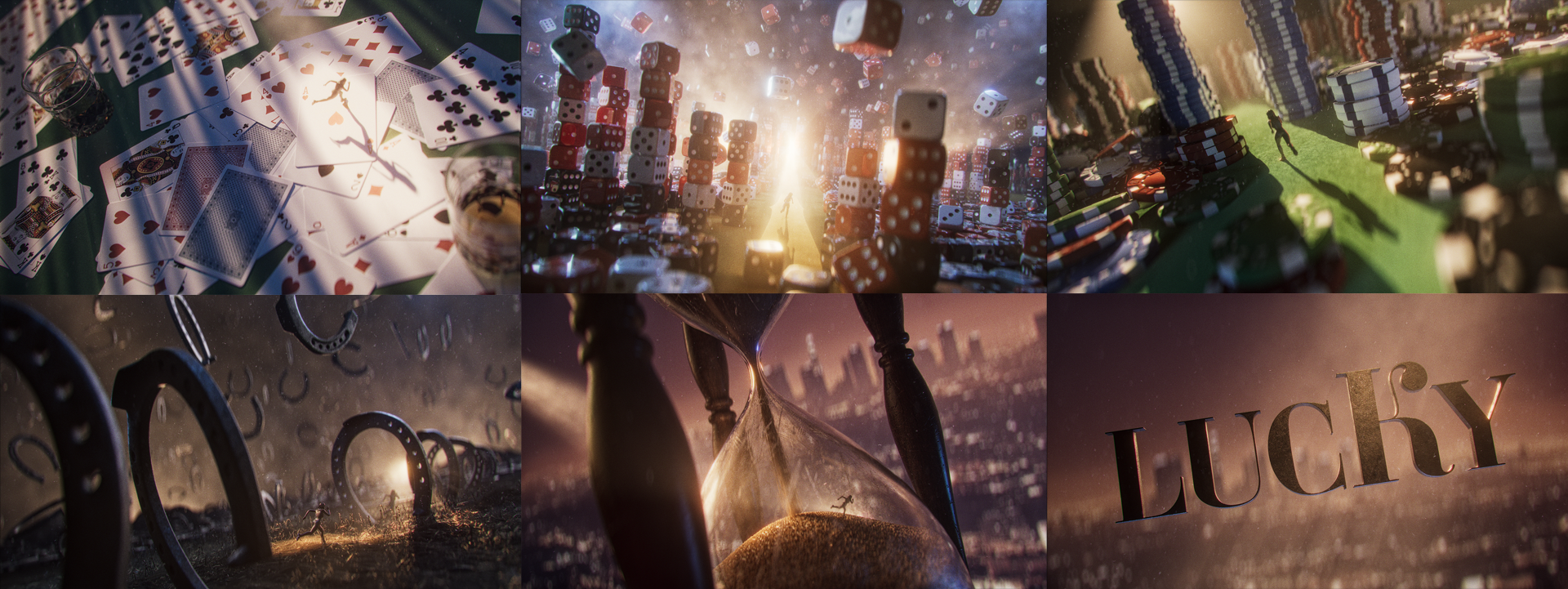
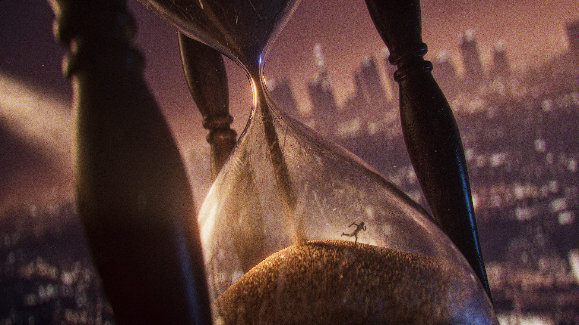
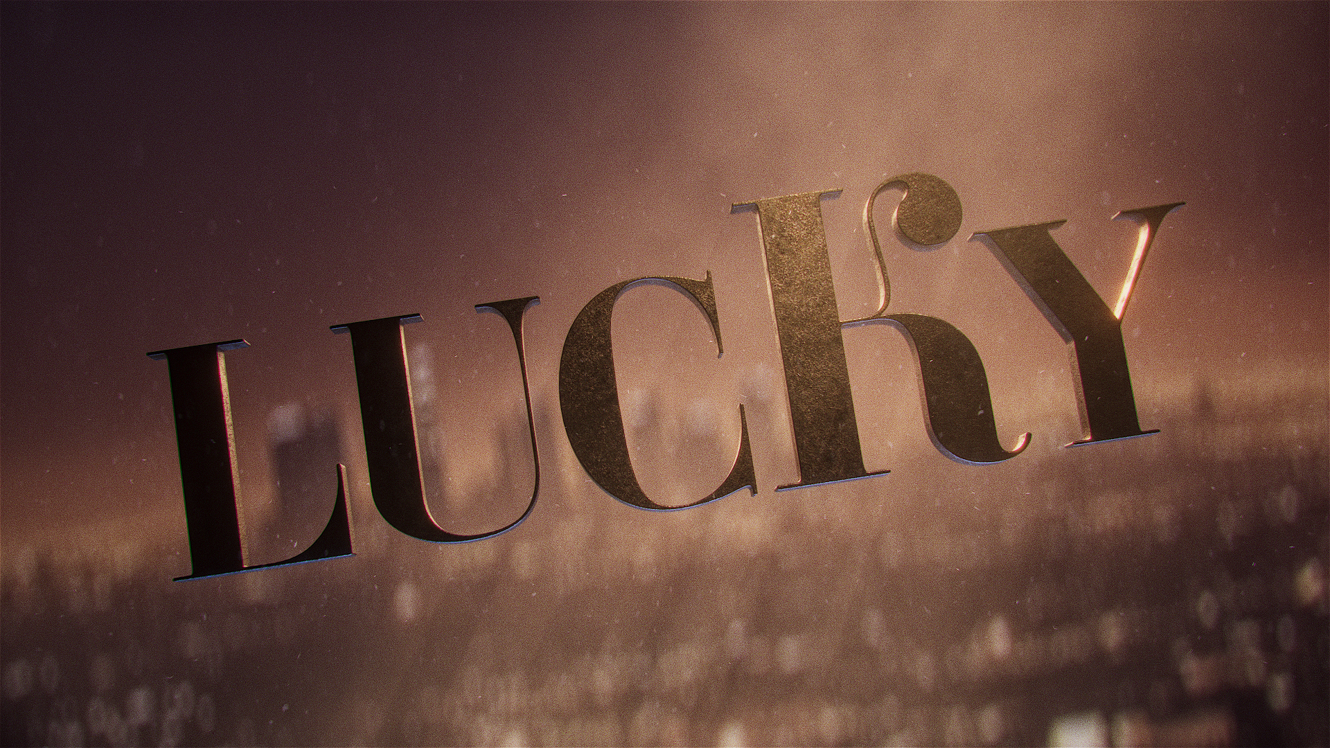
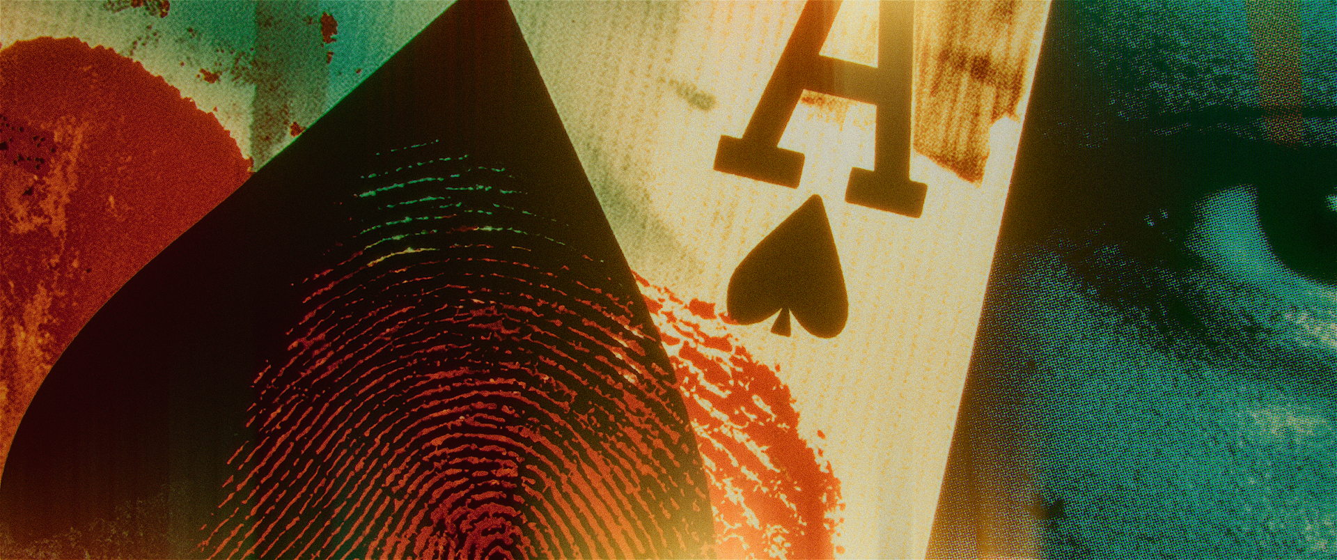
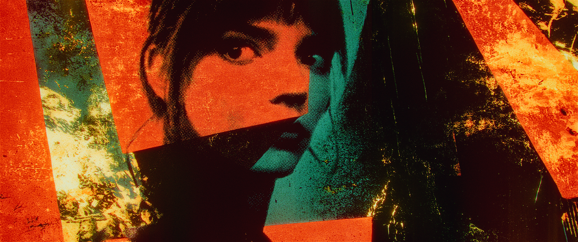
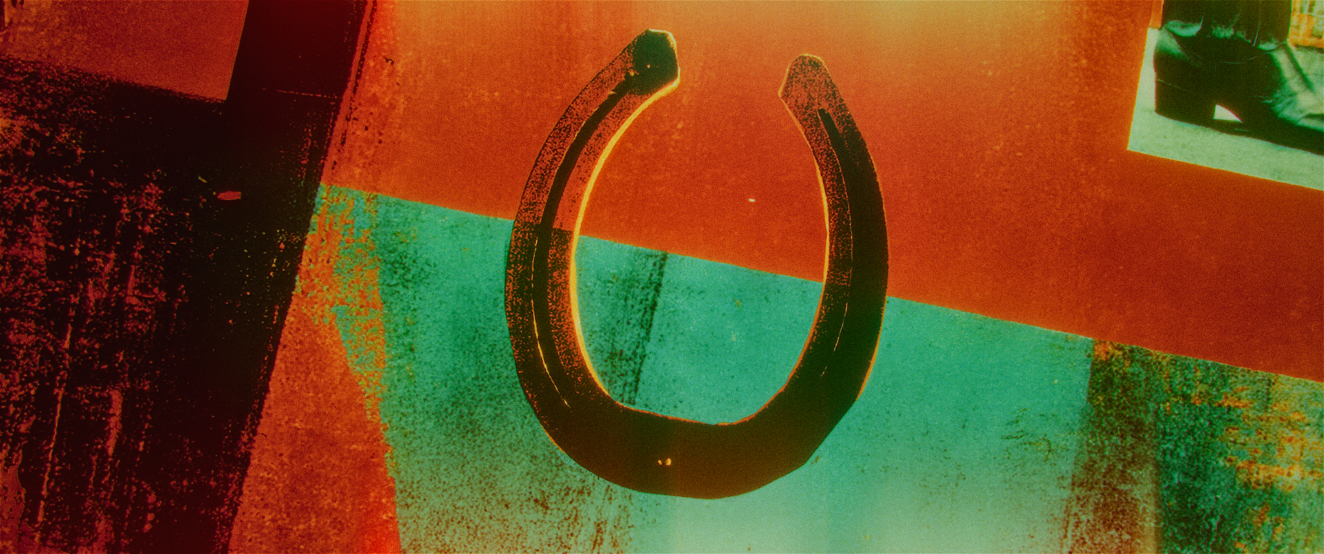
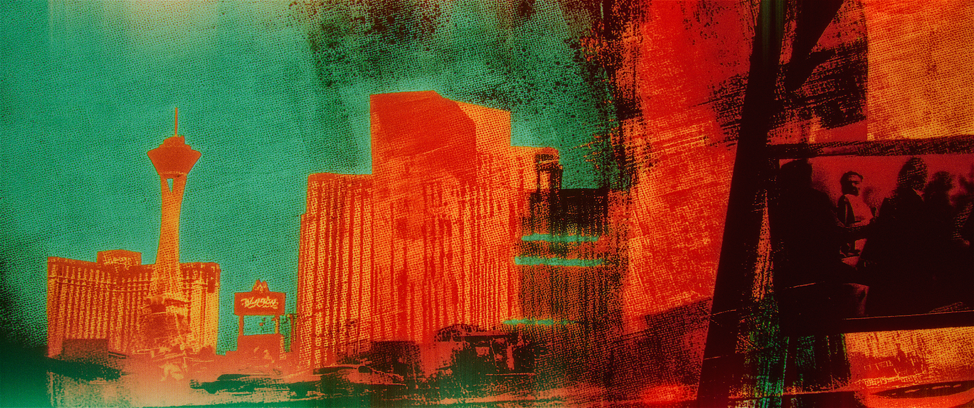
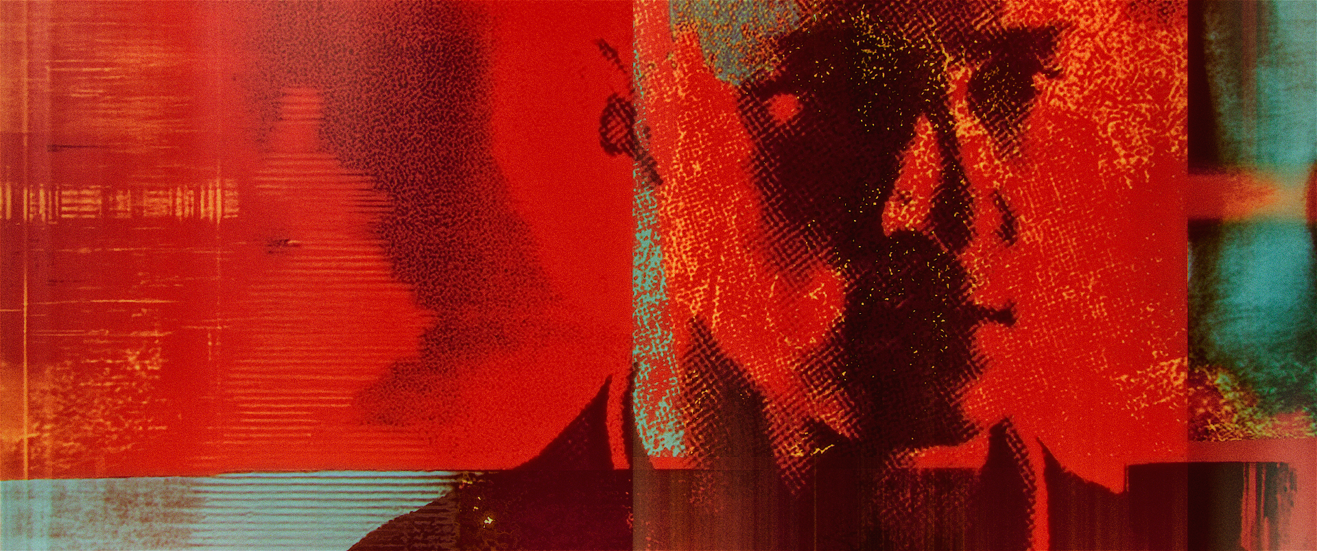
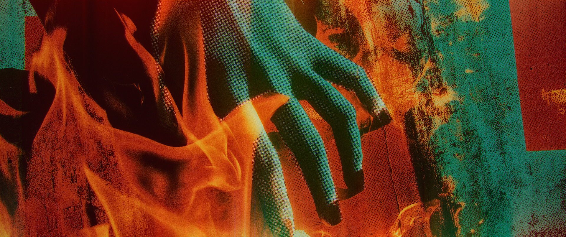
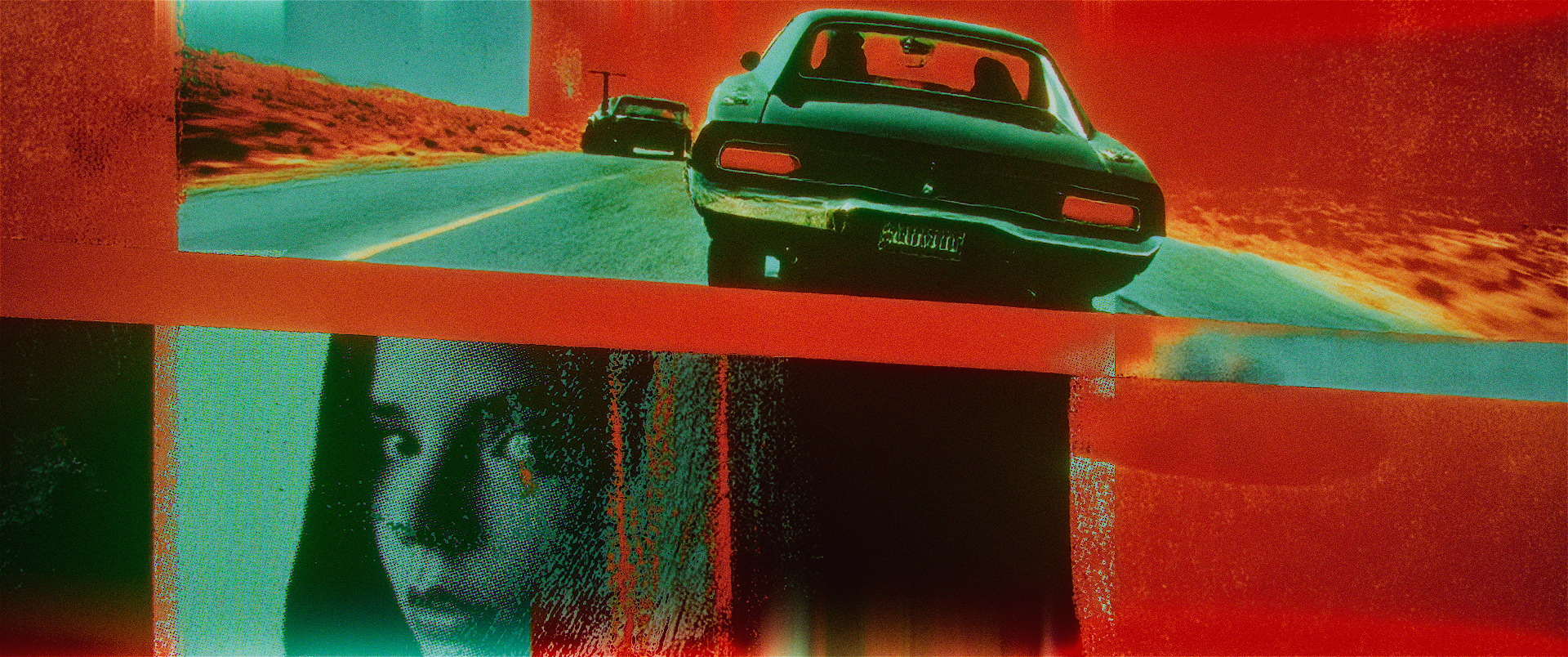
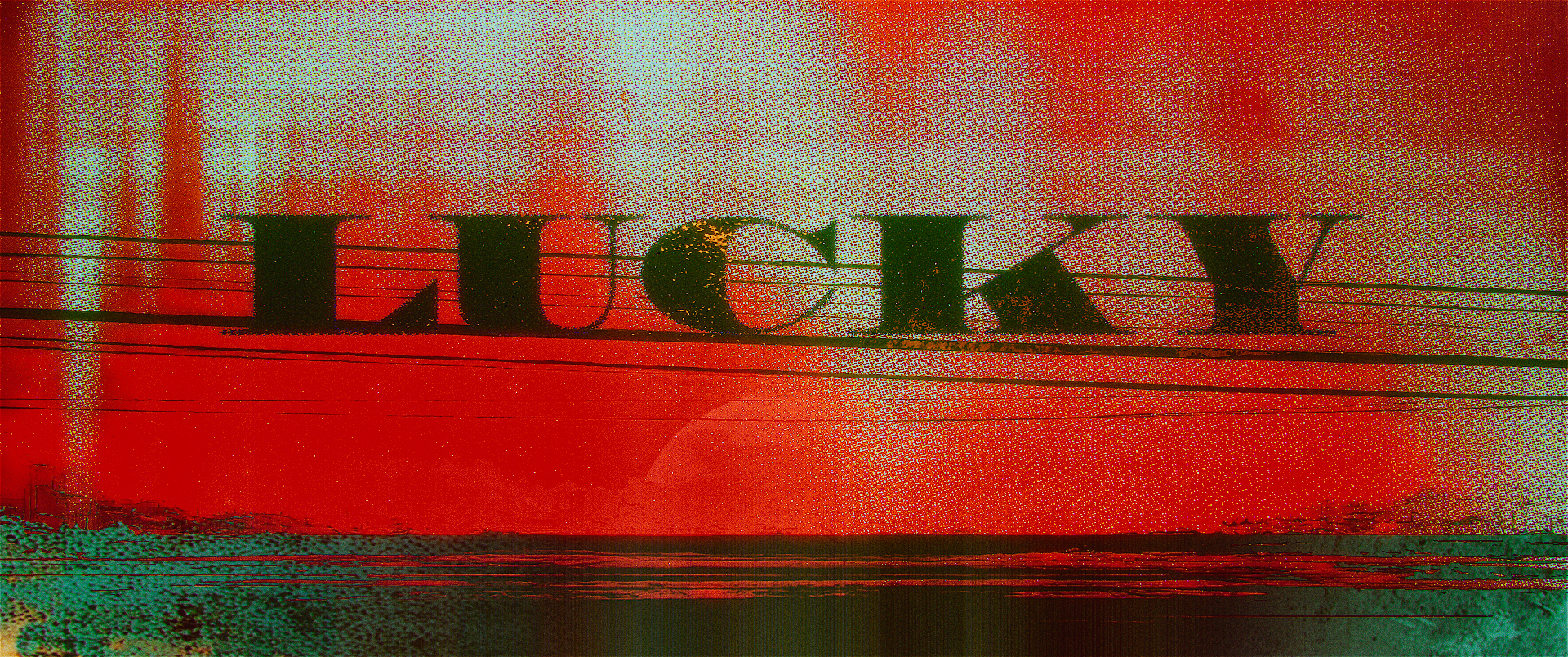
Two distinct directions emerged from the exploration. The Architecture of Chance imagined luck as a surreal physical world—cards, dice, horseshoes, and time transformed into environments built around pursuit. Red-Handed took a fractured editorial approach, combining photography, fingerprints, urban textures, and fragments of evidence into something more immediate and volatile.
The production ultimately moved in another direction, but the work remains a strong example of searching for a project’s visual identity long before footage exists.
Vitals
Concept
Styleframes
Concept : The Architecture of Chance
When these concepts were developed, the series was still largely an unknown. We were working from an early script for the first episode and creative conversations—long before there was footage to respond to. What we did know was that Lucky was fundamentally a chase, propelled by the unpredictable forces of chance and fate.
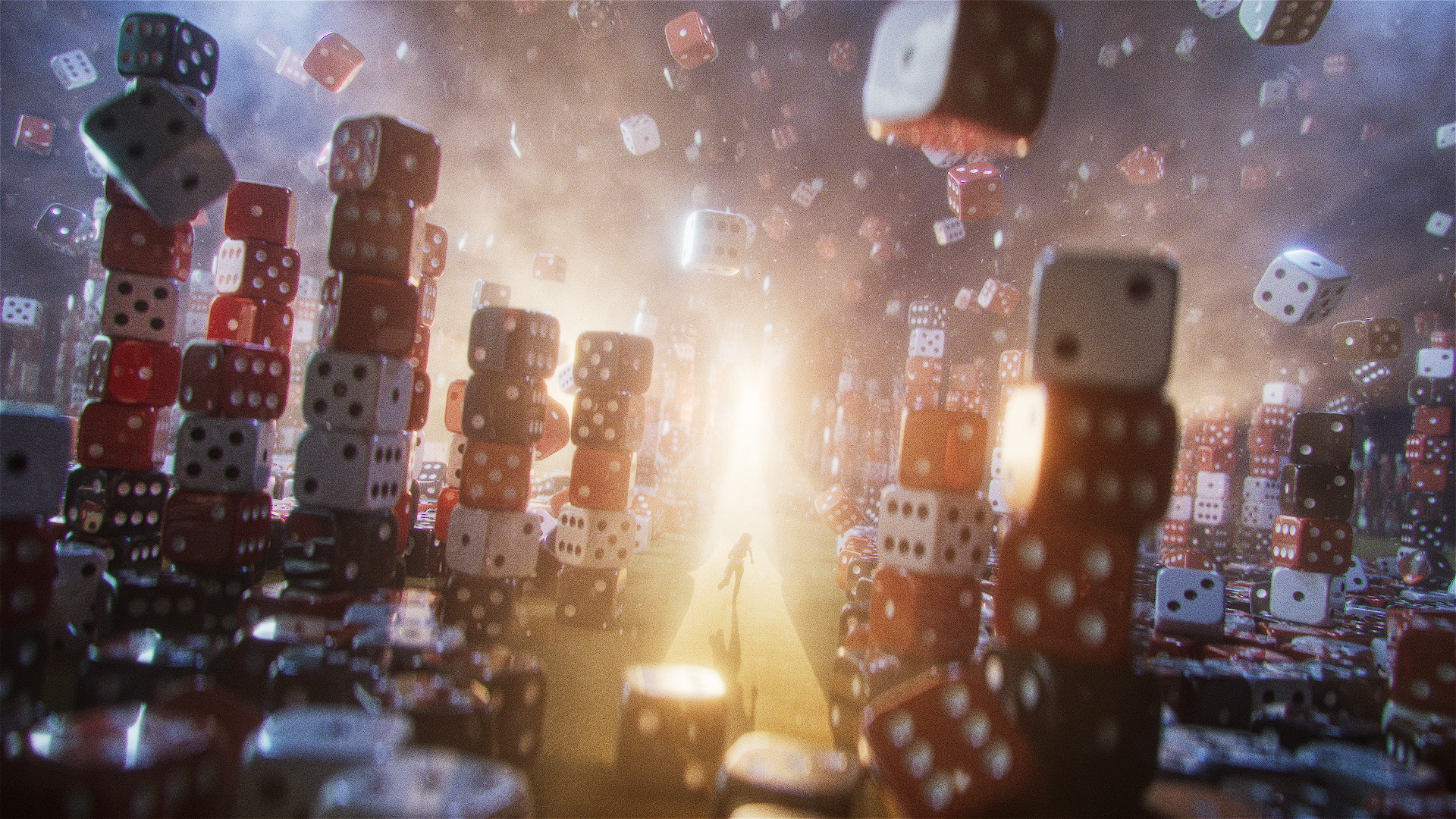
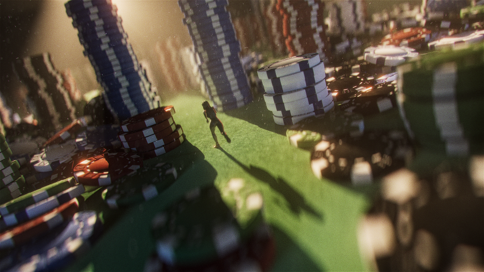
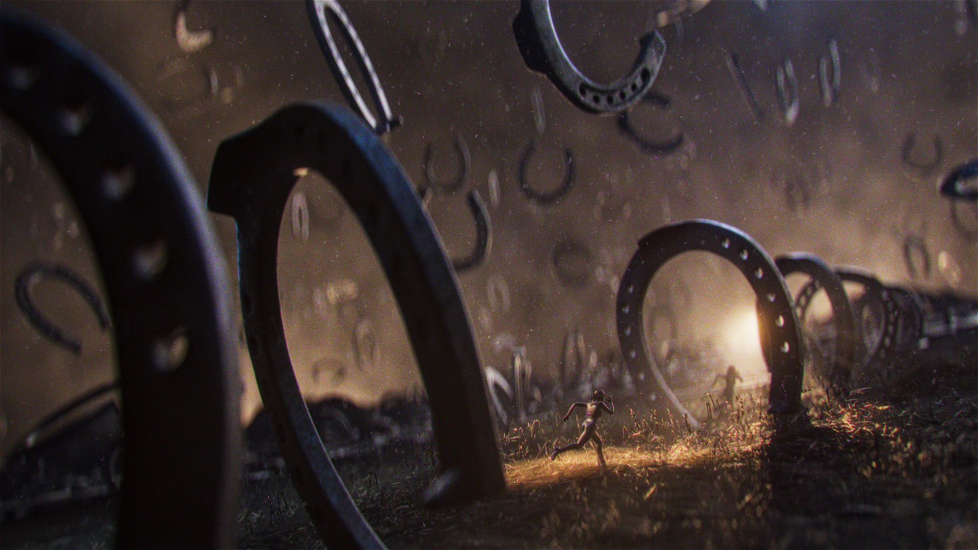
Rather than illustrating specific story beats, these frames imagine luck as a physical world to navigate. Cards become sprawling terrain, dice rise like city blocks, horseshoes transform into towering monuments, and an hourglass reminds us that time is just another adversary. Each environment became another stage in the pursuit—where fortune always seems just out of reach.

CONCEPT : RED-HANDED
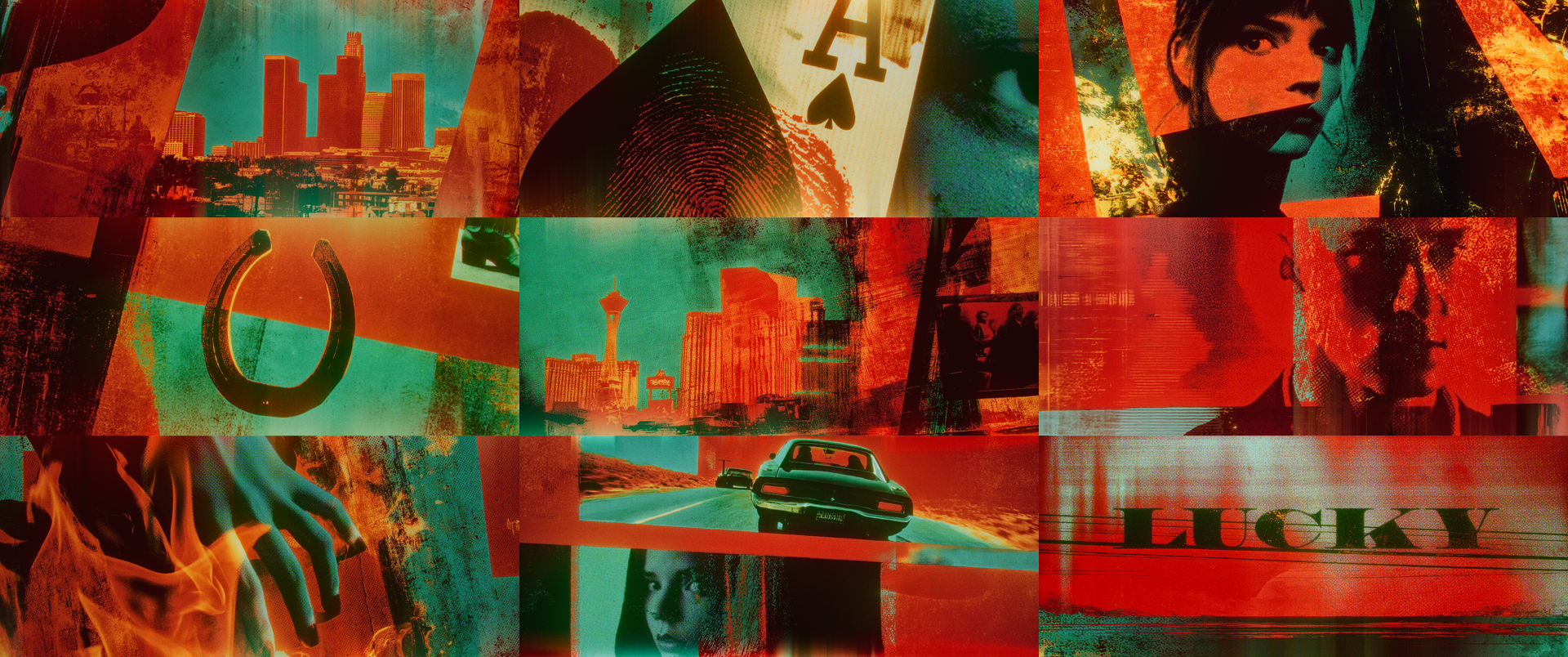
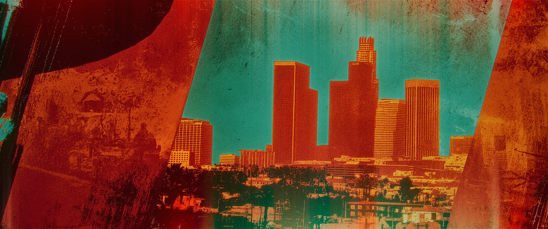
Built from an early script and creative discussions—long before production began—Red-Handed explored the series through a fractured editorial lens. Photographic fragments, fingerprints, playing cards, cityscapes, and fleeting portraits collided like pieces of an investigation board, creating a visual language centered on pursuit, consequence, and the unpredictable nature of luck.
Looking back now that the series has been released, it’s interesting to see how closely this direction aligns with the tone of the finished show. While the final titles ultimately went another way, this exploration remains one of my favorite examples of developing a conceptual visual identity from little more than a script and a creative brief.
Elevating your story through truly moving images.
Let's collaborate on something awesome.

©2026 BOTCHED CREATIVE LLC